Earth Viewer Data Visualization Project
Exploring the World Through Data-Driven 3D Visualizations
Introduction
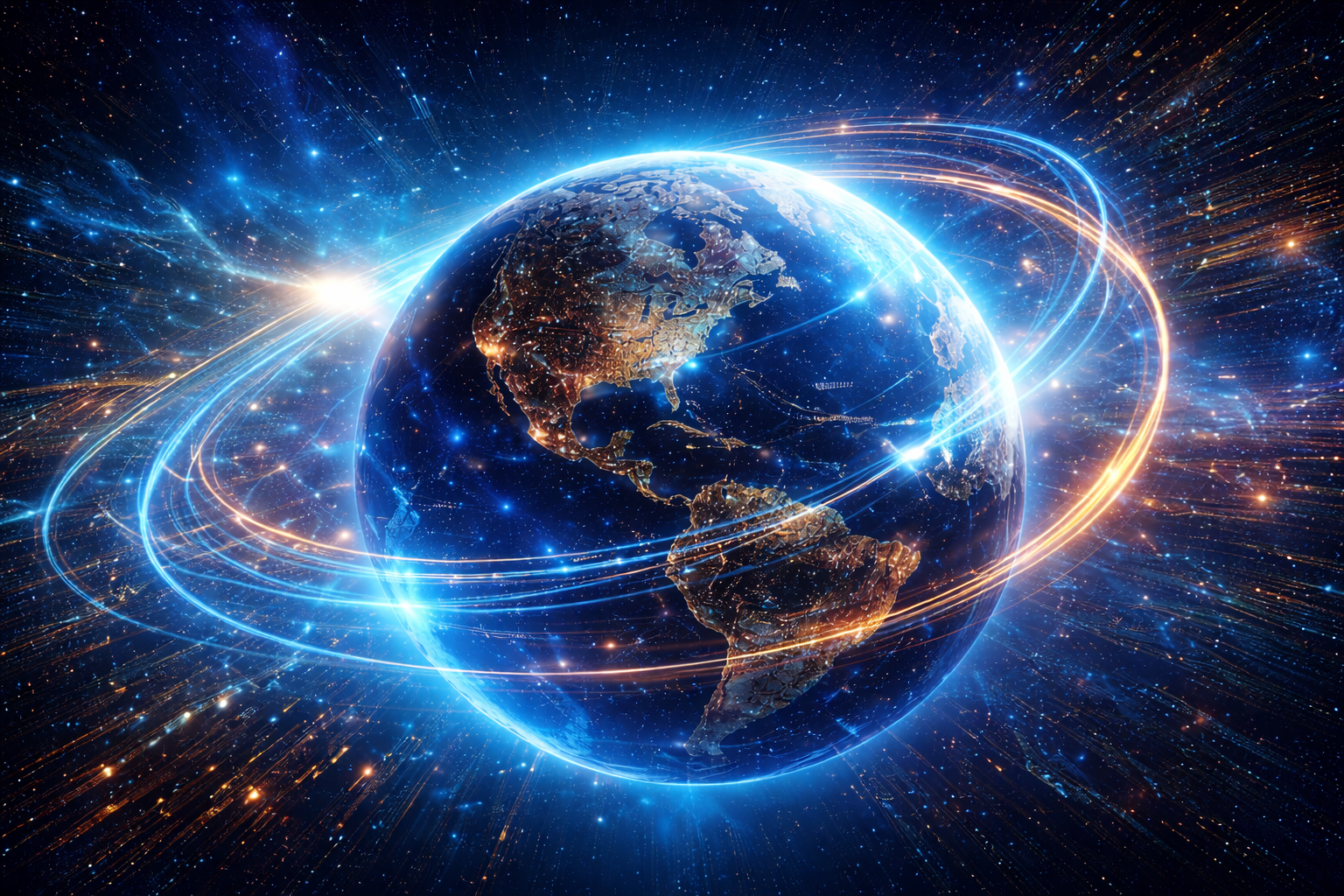
The Earth Viewer Data Visualization Project brings socioeconomic data to life with stunning 3D Earth visualizations. Imagine a platform where you can explore global statistics, compare countries' progress, and analyze trends in an engaging manner. Whether it's GDP, population, or gender inequality, this project visualizes it all seamlessly.
This project combines the power of Flask APIs and React for a robust backend and an immersive frontend.
Watch this video for a detailed demonstration of the project's features and workflow.
The Vision
The project aims to provide an interactive educational tool that transforms static data into actionable insights. With globalization and data-driven decisions at the forefront of modern society, understanding data visually becomes critical. The Earth Viewer allows users to:
- Analyze global data in an engaging 3D format.
- Compare trends across countries for better understanding.
- Uncover hidden relationships in socioeconomic data.
"Data visualization is not just a tool; it's a window to understanding the world."
Key Features
Here are the features that make the Earth Viewer stand out:
-
Immersive 3D Earth Visualization
Using high-resolution textures, the Earth Viewer renders a realistic 3D globe. Users can interact with the globe through zooming, panning, and rotating to explore country-specific data.
-
Real-Time Data Loading
The backend processes datasets like GDP, life expectancy, and fertility rates. APIs dynamically fetch the data, ensuring the frontend displays accurate, up-to-date insights.
-
Country Comparisons
Compare multiple countries across metrics. The visualization highlights differences, helping users analyze socioeconomic disparities globally.
-
User-Friendly Interface
The project employs React components for a clean, modular design. Controls, sidebars, and tooltips ensure an intuitive user experience.
Datasets and Processing
This project integrates key socioeconomic datasets sourced from credible organizations. Data preprocessing involves cleaning, formatting, and optimizing the datasets for visualization.
- Gender Inequality Index
- Country-wise GDP (1994-2017)
- Population and fertility rates
- Life expectancy statistics
Using these datasets, the backend serves APIs that feed data directly into the frontend, ensuring seamless integration.
How It Works
The project follows a streamlined workflow:
- Data Collection: Datasets are collected, cleaned, and stored.
- Backend Processing: Flask APIs process and serve the data in real-time.
- Frontend Visualization: React and Three.js render the data interactively on a 3D globe.
- User Interaction: Users explore countries, compare data, and gain insights effortlessly.
Why This Project Matters
In a world overwhelmed by data, visualization bridges the gap between raw statistics and human understanding. This project is not just a visualization tool but a medium to:
- Empower students and researchers with meaningful insights.
- Enable policymakers to analyze socioeconomic trends quickly.
- Foster awareness among users about global disparities and growth.
"Visual data tells stories that numbers alone cannot."
Developed with passion. Explore the full project on GitHub. For more updates, subscribe to our newsletter.